





Good UX design raises conversion rates by removing the friction between what a visitor wants to do and what your interface lets them do. Faster pages, shorter forms, clearer product information and checkout steps that don’t surprise people all turn more of your existing traffic into orders, sign-ups or quote requests. That’s why your UX design conversion rate belongs in revenue reports. The traffic is already paid for, so every point of improvement lowers the cost of acquiring each customer.
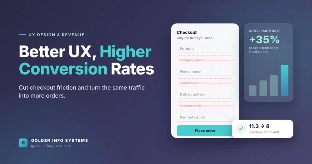
The evidence is concrete. Baymard Institute’s checkout usability research puts the global average cart abandonment rate at 70.19% after 14 years of tracking, and its usability testing shows that the average large e-commerce site could gain a 35% increase in conversion rate through better checkout design alone.
This guide is for founders, SME owners and marketing heads who want to know which UX changes actually move revenue, how to measure them, and in what order to fix them. We’ll cover the factors that matter most, a comparison table of fixes by payback, a step-by-step improvement process, the mistakes we see most often, and how our team at Golden Info Systems runs this kind of work.
1. What UX Design Conversion Rate Means for Your Business
A conversion rate is the share of visitors who complete an action you care about. If 100,000 people visit your store in a month and 2,000 of them buy, your conversion rate is 2%. The action doesn’t have to be a sale. For a B2B software company it might be a demo request; for a study abroad agency, a completed inquiry form; for a SaaS product, a trial account that gets activated.
When we talk about UX design conversion rate, we mean the part of that number your product experience controls. Ad targeting, pricing and brand reputation decide who arrives. UX decides how many of those people manage to do what they came for.
Why small percentage gains add up to real revenue
Conversion math is multiplicative, so small gains compound. Here is a hypothetical example (the figures are illustrative, not from a client): a store gets 50,000 sessions a month, converts 1.5% of them, and has an average order value of BDT 2,400. That’s 750 orders and BDT 1.8 million in monthly revenue. Lift the conversion rate to 1.8% through UX fixes and the same traffic produces 900 orders and BDT 2.16 million. Nothing changed in the ad budget.
The same logic applies to lead generation. If your contact form converts 3% of service-page visitors and you move it to 4%, you’ve increased leads by a third. Your sales team gets more conversations from the same SEO and ad spend.
Macro conversions and micro conversions
A purchase or a signed contract is a macro conversion. The smaller steps that lead to it are micro conversions: adding to cart, starting checkout, opening a pricing table, downloading a brochure. Track both. Micro conversion rates will always look higher, so don’t compare them against your macro rate; use them to find the exact step where people drop out.
This distinction is where conversion-focused design starts. Instead of asking “does the site look good?”, you ask “at which step do we lose people, and what on that screen is stopping them?”
2. The UX Factors That Move Conversion Rates Most
Not every design change affects revenue. The factors below are the ones that most often decide a site’s UX design conversion rate when we audit sites and apps, ordered roughly by how often they’re the main problem.
Page speed and Core Web Vitals
Speed is part of UX because waiting is part of the experience. Google’s web.dev collection of speed case studies documents several measured results: Vodafone found that a 31% improvement in Largest Contentful Paint (LCP) increased sales by 8%, Rakuten 24’s work on Core Web Vitals raised its conversion rate by 33.13% and revenue per visitor by 53.37%, and the BBC found it lost an additional 10% of users for every extra second its site took to load. Speed work can lift a UX design conversion rate before anyone changes the layout.
The three metrics to watch are LCP (how fast the main content appears), Interaction to Next Paint or INP (how quickly the page responds to a tap or click), and Cumulative Layout Shift or CLS (whether things jump around while loading). We covered the targets and fixes in detail in our guide to Core Web Vitals optimization.
Form length and checkout friction
Every extra field is a small tax on the visitor’s patience. Baymard’s study of checkout form fields found the average checkout contains 11.3 form fields, while most sites need only 8. The same research reports that 17% of users have abandoned an order because the checkout was too long or complicated.
Common culprits:
- Separate fields for first name and last name when one “Full name” field works
- A second address line shown by default instead of behind a link
- Forced account creation before payment
- Asking for a phone number with no explanation of why it’s needed
- Coupon code boxes placed so prominently that shoppers leave to hunt for a code
For Bangladeshi stores, the payment step deserves extra attention. If customers expect bKash, Nagad or cash on delivery and only see a card form, they leave. The payment options people trust should be visible on the product page, not revealed at the last step.
Navigation, search and information architecture
People can’t buy what they can’t find. Menus labeled with internal jargon, categories that overlap, and site search that returns nothing for a misspelled product name all cost sales quietly, because analytics shows these visitors as simple exits rather than errors.
Look at your internal search logs. The queries that return zero results are a free list of products, pages or synonyms your users expect to see.
Clarity of the offer and product information
A visitor deciding whether to buy needs answers: what it costs in total, when it will arrive, what happens if it doesn’t fit, and who they’re dealing with. When delivery charges appear only at checkout, the price feels like it went up. Put shipping cost, delivery time and return terms near the price, in plain words.
For service businesses the equivalent is a service page that says what you deliver, in what timeframe, and what the next step looks like. “Contact us for details” converts worse than “Send your requirements and get a scoped estimate within two working days” (if you can actually keep that promise).
Trust signals and error handling
Trust is built by small, specific details: a real address and phone number, visible security for payments, honest stock levels, and reviews you didn’t write yourself. It’s broken by error messages that blame the user, forms that clear every field when one entry is wrong, or a payment failure screen with no next step.
Good error handling is one of the cheapest conversion wins available. Validate fields inline as people type, keep everything they’ve entered, and say exactly what to fix (“Phone number needs 11 digits”) instead of “Invalid input.”
Mobile layout and touch targets
If most of your visitors arrive on phones (check your analytics before assuming), design for the thumb. Primary buttons should be easy to reach and large enough to tap without zooming. Sticky “Add to cart” bars, numeric keyboards for phone fields, and autofill support for addresses all reduce effort on small screens.
Accessibility
Accessible design is usable design. High text contrast, labeled form fields, keyboard support and descriptive link text help people with disabilities, and they also help someone reading in bright sunlight or using a phone one-handed. Following the WCAG 2.2 guidelines removes barriers that block a share of your audience from converting at all.
3. UX ROI Compared: Which Fixes Pay Back First
UX ROI is the return you get from design work measured against what that work cost. Some fixes take a day and pay back within weeks; others are larger projects that only make sense once the basics are done. The table below is our working comparison of how each fix affects UX design conversion rate and UX ROI. Effort figures are estimates for a typical SME website and will vary with your platform, codebase and content.
| UX fix | What it changes | Typical effort (estimate) | How to measure it | Payback speed |
|---|---|---|---|---|
| Remove unneeded checkout or form fields | Fewer abandoned forms | 1 to 3 days | Form start-to-submit rate | Fast |
| Inline validation and clear error messages | Fewer failed submissions | 2 to 5 days | Error events per form session | Fast |
| Show delivery cost, time and returns near price | Fewer surprises at checkout | 1 to 2 days | Cart-to-checkout rate | Fast |
| Guest checkout option | Removes forced sign-up | 3 to 7 days | Checkout completion rate | Fast |
| Image compression and LCP fixes | Faster first view | 1 to 2 weeks | LCP in field data, bounce rate | Medium |
| Local payment methods (bKash, Nagad, COD) shown early | Higher payment confidence | 1 to 3 weeks | Payment step drop-off | Medium |
| Site search with synonyms and typo tolerance | More product discovery | 2 to 4 weeks | Zero-result searches, search-to-cart rate | Medium |
| Navigation and category restructure | Easier browsing | 3 to 6 weeks | Category page exits, tree test success | Slower |
| Full redesign based on user research | Fixes deep structural issues | 2 to 4 months | Macro conversion rate, revenue per visitor | Slowest |
Two rules come out of this table. Start with fixes at the top, because they’re cheap and measurable. Don’t commission a full redesign until you’ve tried the quick fixes and know which problems remain.
How to calculate UX ROI on a single change
Use a simple formula: (extra monthly revenue from the change × 12 − cost of the change) ÷ cost of the change. If a two-week checkout fix costs BDT 150,000 and lifts revenue by BDT 60,000 a month, the first-year return is (720,000 − 150,000) ÷ 150,000 = 3.8, or 380%. These are hypothetical numbers; plug in your own, and use a test period long enough to cover normal weekly swings in traffic.
4. A Step-by-Step Process to Improve Your UX Design Conversion Rate
This is the process we recommend to any team, whether they work with us or not. It runs in a loop, so the last step feeds back into the first.
Step 1: Define the conversions that matter
Write down one macro conversion per business goal (orders, qualified leads, activated trials) and the three to five micro conversions that lead to it. Agree on the definitions with sales and marketing so everyone reads the same numbers.
Step 2: Set up measurement before changing anything
Install event tracking in Google Analytics 4 for each step of the funnel: product view, add to cart, begin checkout, add payment info, purchase. For lead forms, track form start, each field error and form submit. Record at least two to four weeks of baseline data before you touch the design, so you have a baseline UX design conversion rate to compare against.
Step 3: Find the biggest drop-off
Build a funnel report and look for the step with the largest loss. That step is where you’ll get the most return per hour of work. Pair the numbers with session recordings or heatmaps (Microsoft Clarity is free) to see what people actually do on that screen.
Step 4: Talk to real users
Analytics tells you where people leave; it rarely tells you why. Run short moderated usability tests on the problem step. According to Nielsen Norman Group’s introduction to usability, testing with 5 users is typically enough to find a design’s most important problems. The same article cites current best practice as spending about 10% of a design project’s budget on usability.
Ask participants to complete a real task (“buy this item and pay with bKash”) and stay quiet while they work. Note every hesitation.
Step 5: Write a hypothesis for each fix
Turn each finding into a testable statement. For example: “If we remove the company name field from the quote form, form completions will rise, because 4 of 5 test users paused there.” A hypothesis keeps the team honest about what it expects to happen.
Step 6: Prototype and review
Mock up the change in Figma, check it on a real phone, and review it against accessibility basics (contrast, labels, focus order). Small fixes can skip straight to development; larger ones should be tested as clickable prototypes first.
Step 7: Ship and test
If your traffic is large enough, run an A/B test with a tool such as VWO or Optimizely. If it isn’t, ship the change and compare the same funnel step against your baseline for the same number of weeks. Watch for outside factors (a sale, a holiday, a new ad campaign) that could distort the result.
Step 8: Record the result and repeat
Log every change, the date it went live, and the measured effect. Over a year this log becomes your best evidence for UX ROI, and it stops the team from repeating experiments that already failed.
Quick conversion audit checklist
- Pages load their main content in under 2.5 seconds on a mid-range phone
- Checkout or lead form has no field you can’t justify
- Guest checkout is available
- Total price, including delivery, is visible before checkout
- Preferred local payment methods appear on product pages
- Error messages say exactly what to fix and keep entered data
- Primary buttons are easy to reach and tap on mobile
- Site search handles typos and synonyms
- Contact details and business address are easy to find
- Text contrast and form labels meet WCAG 2.2 AA
5. Common Mistakes That Hurt Conversion-Focused Design
These are the patterns we see most often when a business asks why a new design didn’t lift sales or its UX design conversion rate.
Redesigning without a baseline
If you don’t measure before you change, you can’t prove the change worked. Teams that skip baselines often argue about results for months because nobody can show what “before” looked like.
Treating UX as decoration
A new color palette and fresh photography can make a site feel modern, but they rarely fix the form that’s losing half its users. Visual polish matters for trust; it can’t replace removing friction.
Copying a competitor’s layout
Your competitor’s checkout was designed for its customers, its products and its payment setup. Copying it imports their problems along with their strengths. Use competitors for ideas, then test with your own users.
Chasing the conversion rate instead of revenue
Aggressive pop-ups, fake countdown timers and pre-ticked add-ons can push a short-term number up while raising refunds, complaints and unsubscribes. Optimize for revenue per visitor and repeat purchase rate. A single conversion figure can hide the damage.
Ignoring the mobile experience
Many teams design on large monitors and check mobile at the end. If phones bring most of your traffic, review every design decision on a phone first.
Testing too many things at once
If you change the headline, the button, the form and the images in one release, you won’t know which change helped or hurt. Group related changes, or test one variable at a time when traffic allows.
Forgetting the people with the least patience
Users on slow connections, older phones, or with visual impairments hit every problem harder. One of the clearest user-centered design benefits is that fixing problems for these groups usually improves results for everyone else too.
6. How Golden Info Systems Approaches UX Design Conversion Rate Projects
At Golden Info Systems, we treat UX as a measurable part of the product. Our UI/UX design services cover user research and analysis, wireframing and prototyping, visual design and branding, technical design, usability testing, and software redesign for products that look or work below the standard their users expect. If you’re unsure where design work should start, our explainer on UI vs UX design is a good primer.
Every project follows our four-phase process:
- Requirements. We start with detailed discussions to define scope, goals and the conversions that matter, and we review your analytics so the work starts from data.
- Planning. We map the funnel, prioritize fixes by expected return, and agree on how each change will be measured.
- Execution. Our designers, developers and engineers build the changes, with regular updates so you see progress as it happens.
- Delivery. Testing and quality assurance come before release, followed by measurement against the baseline.
Our team is 100% in-house, which means the people who research and design your interface are the same people who build it. That matters for conversion work, because many fixes (inline validation, faster image loading, local payment integration) live in the code rather than in the mockup. When a project involves an online store, our e-commerce development team handles checkout, payment gateways and performance alongside the design.
Golden Info Systems is a BASIS member company in Dhaka with 12+ years of experience and 850+ completed projects across web, mobile, AI and custom software. We work with startups, SMEs and enterprise teams in Bangladesh and abroad, in sectors from retail and e-commerce to healthcare, education and finance.
7. Frequently Asked Questions
How does UX design affect conversion rate?
UX design affects conversion rate by deciding how easy it is for a visitor to finish the task they came for. Slow pages, confusing menus, long forms and surprise costs at checkout all cause people to leave before converting. Fixing them means more of the same traffic becomes orders or leads. Baymard Institute’s testing suggests the average large e-commerce site could raise its conversion rate by 35% through better checkout design alone, so the UX design conversion rate is often the cheapest growth lever a business has.
What is a good conversion rate for a website?
There’s no single good number, because conversion rates vary by industry, price point, traffic source and the action being measured. A store selling low-cost items will usually convert better than one selling expensive equipment, and a newsletter sign-up converts better than a purchase. The most useful benchmark is your own history: a good conversion rate is one that’s higher than last quarter’s. Track it by device and traffic source, since an average across all visitors can hide a broken mobile funnel.
How do you measure UX ROI?
Measure UX ROI by comparing the extra revenue a design change produces with what the change cost. First, record a baseline for the funnel step you’re improving. After the change ships, measure the same step for the same length of time, or run an A/B test. Multiply the revenue lift over a year, subtract the cost of the work, and divide by that cost. Keep a log of every change so the evidence builds up over time.
How long does it take to see results from UX improvements?
Small fixes such as shorter forms, clearer error messages or visible delivery costs can show measurable effects within two to four weeks if your site has steady traffic. Larger changes, such as a navigation restructure or a full redesign, may take two to three months to show a reliable trend. Sites with low traffic need longer test windows because a few orders either way can swing the percentage. Always compare equal periods and note any sales or campaigns that ran.
Do I need A/B testing if my website has low traffic?
Not necessarily. A/B testing needs enough conversions in each variant to give a trustworthy result, and many small business sites don’t have that volume. In that case, rely on usability testing with five or so real users, session recordings and a before-and-after comparison of the same funnel step. These methods won’t give you statistical certainty, but they’ll catch the obvious problems that cost the most money. Move to A/B testing once traffic grows enough to support it.
What are the user-centered design benefits for a small business?
The main user-centered design benefits for a small business are fewer wasted features, higher conversion rates and lower support costs. When you design around real user research instead of assumptions, you build what people actually need and remove steps they find confusing. That reduces the number of support calls and refund requests. It also makes marketing spend go further, because more of the visitors you pay to attract can complete a purchase or inquiry without help.
Is website speed part of UX design?
Yes. Speed shapes how a product feels to use, so it’s part of the user experience even though it’s handled mostly by developers. Google’s case studies on web.dev show measured results: Vodafone saw 8% more sales after improving Largest Contentful Paint by 31%. A beautiful page that takes six seconds to appear on a phone will still lose visitors. Good UX teams set performance budgets during design, such as limits on image sizes and third-party scripts, rather than leaving speed to the end.
8. Practical Next Step
Open your analytics this week and find the single funnel step where you lose the most visitors: product page to cart, cart to checkout, or form start to submit. Write that number down as your baseline. Then send it to our team with a link to the page, and we’ll review the step and tell you which fixes from the table above should come first to improve your UX design conversion rate.