





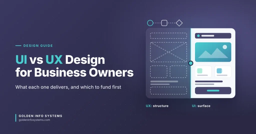
UI vs UX design comes down to scope. UI (user interface) design is the visible layer of a product: the screens, buttons, type, colors, spacing and the states each control can be in. UX (user experience) design covers everything that decides whether a person can reach their goal with that product, from the research behind a feature to the number of steps between “add to cart” and a paid order.
So a good UI makes a screen clear and pleasant to use. A good UX makes sure it’s the right screen, in the right place, solving a problem real users actually have. You need both, but you don’t need them in equal measure at every stage. Most budget mistakes start right there.
This guide is written for founders, SME owners and marketing heads who are about to brief a designer or an agency. We’ll explain what each discipline produces, how to tell which one your product is short on, what a sound design process looks like, and the mistakes we see most often when companies buy design work.
1. What UI vs UX Design Means for Your Business
Nielsen Norman Group, the usability research firm founded by Don Norman and Jakob Nielsen, defines user experience as something that “encompasses all aspects of the end-user’s interaction with the company, its services, and its products.” Their article on the definition of user experience also makes a point that matters for anyone paying for design: a product can have a well-designed interface and still deliver a poor experience. Their example is a movie site with an excellent search screen that returns nothing useful because the catalog is missing small independent films.
That example is worth keeping in mind. Polished screens can’t fix a product that does the wrong job.
What user interface design covers
User interface design is the craft of making each screen readable, consistent and easy to operate. A UI designer decides the type scale (for example, 16 px body text with 24 px line height on mobile), the color palette and its contrast, the grid, the icon set, and the look of every component: buttons, inputs, tabs, cards, modals, toasts. They also design the states that clients often forget to ask for, such as hover, focus, disabled, loading, empty, error and success.
The output is usually a high-fidelity mockup in a tool like Figma, plus a component library or design system that developers build from. When the UI is right, users don’t notice it. When it’s wrong, they hesitate, misread labels, tap the wrong target or abandon a form halfway.
What UX design covers
UX design starts before any screen exists. It asks who the users are, what they’re trying to get done, what stops them today and how the product should be organized so the main tasks take the fewest steps. Typical UX work includes stakeholder interviews, user interviews, analytics review, competitor teardown, information architecture, user flows, wireframes and usability testing.
The output is less glamorous: research notes, personas built from real interviews (not invented ones), sitemaps, flow diagrams and gray-box wireframes. These documents are what keep a team from spending three months building a feature nobody uses.
Why the difference changes what you pay for
If your users can’t find a feature, abandon sign-up at step four or keep calling support to ask how something works, you have a UX problem. A visual refresh won’t fix it. If people complete tasks but your product looks dated, inconsistent across pages or hard to read on a phone, you have a UI problem; a focused interface redesign may be all you need.
Getting the UI vs UX design diagnosis right before you hire is the cheapest decision you’ll make in the whole project.
2. The Key Factors Behind Each Discipline
The two disciplines share tools and often share people. Still, each one rests on its own set of inputs and skills. Knowing them helps you judge a proposal or a portfolio.
Research inputs that drive UX decisions
Good UX decisions come from evidence. The main sources are:
- User interviews: 30 to 45 minute conversations with five to eight people from your real audience, focused on what they do today, not what they say they’d like.
- Analytics: funnel reports and drop-off points from Google Analytics 4 or your product database, which show where people quit.
- Session recordings and heatmaps: tools such as Hotjar or Microsoft Clarity show where users click, scroll and get stuck.
- Support tickets and sales call notes: the questions customers repeat are usually design problems in disguise.
- Usability testing: watching people try to complete specific tasks on a prototype or live product.
On testing, you need fewer participants than most clients assume. Jakob Nielsen’s research on why you only need to test with 5 users found that a study with five participants surfaced about 85% of the usability problems, and he recommends running several small rounds rather than one large one. For a startup, three rounds of five users each, with fixes between rounds, will teach you far more than one study with fifteen.
Information architecture and user flows
Information architecture is how content and features are grouped, labeled and ordered. It decides what goes in the main menu, what lives in settings and what a category page is called. A user flow maps the exact steps a person takes to finish one task, such as “book a consultation” or “renew a membership.”
This is where UX work saves real money. Cutting a checkout from seven fields to four, or merging two confusing menu items into one clear one, often does more for conversion than any color change.
The visual system behind user interface design
User interface design runs on a system, not a collection of pretty screens. A mature UI system defines:
- a type scale with clear sizes for headings, body, captions and labels
- a color palette with roles (primary action, secondary action, success, warning, error, surface, text)
- spacing tokens, usually on a 4 px or 8 px grid
- a library of components with every state documented
- rules for icons, imagery and motion
When this system exists, developers build faster because they reuse components instead of interpreting each screen from scratch. When it doesn’t, you get five slightly different blue buttons and a front end that’s expensive to maintain.
Accessibility is shared work
Accessibility sits across both disciplines. The current standard is WCAG 2.2, which the W3C published on 5 October 2023 and updated on 12 December 2024 (see the W3C’s WCAG overview). Its contrast rule, Success Criterion 1.4.3, requires a contrast ratio of at least 4.5:1 for normal text and 3:1 for large text.
Contrast, font size and focus states are UI decisions. Logical heading order, clear error messages, keyboard paths through a form and enough time to complete a task are UX decisions. A designer who treats accessibility as a final checklist item will miss half of it.
Tools each side uses
Tools overlap more than job titles suggest. Figma is the default for both wireframes and high-fidelity UI today, with FigJam or Miro used for workshops and flow mapping. UX researchers add survey tools, recording tools and remote testing platforms such as Maze or Lookback. UI designers add icon libraries, prototyping plugins and handoff features like Figma’s Dev Mode. The tool list matters less than the artifacts: ask to see research notes and flows alongside the final screens.
3. UI vs UX Design Compared: A Decision Table
The table below puts UI vs UX design side by side on the points that affect your budget and timeline. Use it when you read a proposal: each line item should map to one of these columns.
| Aspect | UX design | UI design |
|---|---|---|
| Core question | Is this the right product and flow for these users? | Is each screen clear, consistent and easy to operate? |
| Main inputs | Interviews, analytics, support data, competitor review | Brand guidelines, UX wireframes, platform conventions (iOS, Android, web) |
| Typical deliverables | Research summary, personas, sitemap, user flows, wireframes, test reports | High-fidelity mockups, design system, component states, interactive prototype |
| Common tools | Figma, FigJam or Miro, Maze, Hotjar, Google Analytics 4 | Figma, icon libraries, Dev Mode or similar handoff tools |
| When it happens | Mostly before and between build cycles | After structure is agreed, then alongside development |
| How you measure it | Task completion rate, time on task, drop-off, support tickets | Visual consistency, readability, contrast checks, developer rework |
| What failure looks like | People can’t find features or quit mid-flow | Product looks dated, inconsistent or hard to read |
Scope also depends on where your product is today. This second table matches common situations to where we’d put the first design hour.
| Your situation | Start with | Why |
|---|---|---|
| New product idea, no users yet | UX research and flows | Validate the problem and main tasks before paying for polished screens |
| MVP live, users drop off in sign-up or checkout | UX audit and usability testing | The data already points to a flow problem |
| Product works but looks dated or inconsistent | UI redesign and design system | Tasks succeed; the visual layer needs work |
| Moving a web product to mobile apps | UX for mobile flows, then UI per platform | Mobile users have different contexts and screen limits |
| Rebranding the company | UI update, with a light UX review | Visual change is the goal, but check that labels and flows still make sense |
| Many support calls about “how do I…” | UX review of labels, flows and onboarding | Repeated questions point to unclear structure |
If you’re also weighing what kind of product to build, our guide on web application vs website explains how that choice changes the amount of UX work involved. A marketing site needs clear content structure; a web application with logins, roles and dashboards needs much deeper flow design.
4. Step-by-Step: How to Get UI and UX Right on Your Next Project
The steps below work for a new product or a redesign. You can follow them with an in-house team or use them to check an agency’s process.
- Write down the business goal in one sentence. For example, “increase completed online consultation bookings” or “cut onboarding support calls.” A design brief without a measurable goal invites endless opinion debates.
- Collect what you already know. Pull 90 days of analytics, the top 20 support questions and any sales objections. This takes a day and often reveals the main problem before research starts.
- Talk to five to eight real users. Ask them to describe the last time they did the task your product supports. Record the steps, the tools they used and where they got annoyed.
- Map the main tasks and flows. List the three to five tasks that matter most and draw each one as a flow. Count the steps and the decisions. Every step you remove is one less place to lose a customer.
- Wireframe in grayscale first. Low-fidelity wireframes keep the discussion on structure and content. Clients who see color too early start debating shades of blue instead of whether the form asks for the right data.
- Test the wireframes or a clickable prototype. Give five users specific tasks and watch silently. Fix what they struggle with, then test again.
- Build the UI system. Define type, color, spacing and components with all their states. Check every text and background pair against the 4.5:1 contrast minimum.
- Design high-fidelity screens from the system. Apply the components to the tested flows. Include empty, loading and error states for every screen, because developers will otherwise invent them.
- Hand off with specs and stay involved. Share the Figma file with developer access, annotate interactions and review the build in staging. Design that’s “thrown over the wall” rarely ships as designed.
- Measure after launch. Compare task completion and drop-off against your baseline from step 2. Plan a small UX review 60 to 90 days after release.
For an early-stage product, steps 3 to 6 matter most. Our guide to mobile app MVP development covers how to keep that first version small enough to test cheaply.
A quick self-check before you sign off designs
Before you approve a design, run through this list:
- Can a new user complete the main task without help?
- Does every screen have one clear primary action?
- Are error messages specific (“Phone number must have 11 digits”) instead of generic (“Invalid input”)?
- Do text and buttons meet the 4.5:1 contrast ratio?
- Are touch targets large enough for a thumb on a 6-inch phone?
- Has anyone outside the project team tested it?
If two or more answers are “no,” the design isn’t ready for development.
5. Common Mistakes to Avoid
The UI vs UX design mistakes below show up in every industry we work in, from hospital systems to e-commerce stores and membership portals.
Treating UX as a visual refresh
The most expensive mistake is asking for “a new look” when the real problem is the flow. Teams spend weeks on mockups and launch, only to see the same drop-off numbers because the seven-step checkout is still seven steps. Diagnose first.
Skipping research because “we know our users”
Founders know their market. They rarely know how a first-time user reads a label at 11 p.m. on a mid-range Android phone with a weak connection. Five interviews cost a few days and frequently overturn at least one major assumption.
Hiring for UI when you need UX (or the reverse)
A designer with a beautiful Dribbble portfolio may never have run a usability test. A researcher who writes excellent reports may not produce a design system developers can use. Ask candidates or agencies that sell user experience design services to show the process behind one project, from research notes to final screens.
Designing only the happy path
Mockups often show a full dashboard with perfect data. Real users see empty states on day one, slow connections, failed payments and expired sessions. If those states aren’t designed, developers will improvise them. The product then feels unfinished.
Ignoring accessibility until the end
Retrofitting contrast, focus order and form labels after development costs far more than designing them in. It also shuts out users with low vision, color blindness or motor impairments, who are customers like anyone else.
Letting the design system drift
Without one owner, every new feature adds a slightly different button or card. After a year, the product looks inconsistent and front-end code grows heavier. Assign ownership of the component library, even if it’s one person spending a few hours a month.
Measuring nothing
If you don’t record a baseline before the redesign, you can’t prove the redesign worked. Pick two or three numbers (completion rate, drop-off at a named step, support tickets per week) and track them before and after.
6. How Golden Info Systems Approaches UI/UX Design
At Golden Info Systems, we treat UI and UX as one service delivered by one team, because splitting them across vendors is where context gets lost. Our user experience design services cover user research and analysis, wireframing and prototyping, visual design and branding, technical design, usability testing and redesign of existing apps and websites. The same team then works with our developers, so the interface you approve is the interface that ships.
Our 4-phase process
We run design inside the same four phases we use for every project, described in detail in our software development process guide:
- Requirements: we study your business goal, your users and your existing data, and agree on the tasks the product must support.
- Planning: we map information architecture and user flows, produce wireframes and test them before visual design begins.
- Execution: we build the UI system and high-fidelity screens, then our developers build from them with regular reviews and calls so you see progress as it happens.
- Delivery: we launch, check the build against the approved design and help you measure results.
What you can expect from us
- A 100% in-house team: we don’t hand your project to freelancers, so designers and developers sit together and solve problems quickly.
- Experience across sectors: we’ve worked in 12 industry sectors, including banking and finance, healthcare, retail and e-commerce, and education and e-learning.
- A track record: Golden Info Systems has 12+ years of experience and more than 850 completed projects.
- Recognized memberships: we’re a member of BASIS, Bangladesh Computer Samity and e-CAB.
If you’re comparing a UI/UX design company in Bangladesh against teams elsewhere, ask every shortlisted vendor the same questions: who does the research, who builds the design system, and how design and development stay connected after handoff. We’re happy to answer them for our own team in a 30-minute call. As a UI/UX design company Bangladesh businesses and overseas startups both work with, we’d rather show you our process than promise outcomes we haven’t measured on your product.
7. Frequently Asked Questions
What is the main difference between UI and UX design?
UX design decides what a product should do and how users move through it, based on research into their goals and problems. UI design decides how each screen looks and behaves: type, color, spacing, components and their states. UX produces flows, wireframes and test findings; UI produces high-fidelity mockups and a design system. In practice they overlap. On small projects, one designer often does both. The key point for a business is to know which one your current problem needs, so you don’t pay for polish when the flow is broken.
Which comes first, UI or UX?
UX comes first in almost every project. You need to know who the users are, which tasks matter and how screens connect before it makes sense to choose colors or refine buttons. A typical sequence is research, flows, wireframes, testing, then the UI system and final screens. The exception is a pure visual refresh, where tasks already work well and the goal is a modern, consistent look. Even then, a short UX review is worth doing, because rebrands often change labels and menu names that users rely on.
Can one designer handle both UI and UX?
Yes. On small and mid-sized projects a single product designer often handles both, which can work well because nothing gets lost between people. The risk is that most designers are stronger on one side. Ask to see a full case study: research notes, flows, wireframes, test results and final screens. If a portfolio shows only polished screens, the designer may be UI-focused. For larger products with many user roles, a team with a dedicated UX researcher and a UI designer usually delivers better results.
How much does UI/UX design cost?
Cost depends on the number of user roles, unique screens, platforms (web, iOS, Android), research depth and the need for a full design system. By our estimate, a multi-role SaaS dashboard can take many times the design effort of a landing page redesign. Rather than relying on a generic price list, prepare a short brief listing your users, main tasks, platforms and existing assets, then ask vendors for a phased estimate. A good partner will separate research, UX, UI and development costs so you can see what each phase buys.
How do I know if my product has a UX problem or a UI problem?
Look at behavior first. If users drop off at a specific step, can’t find features, or keep asking support the same “how do I” questions, the problem is UX: structure, flow or labeling. If users complete tasks but describe the product as outdated, cluttered or hard to read, and your pages look inconsistent with each other, the problem is mostly UI. Analytics funnels, session recordings and five quick usability tests will usually settle the question within a week.
Does UI/UX design affect SEO?
Yes, indirectly. Google’s page experience guidance covers Core Web Vitals, HTTPS and avoiding intrusive interstitials; design choices affect two of those directly. Heavy hero images, layout shifts from late-loading banners and pop-ups that cover content hurt those signals. Clear headings, readable text and logical internal links help both users and search engines understand a page. Our guide to Core Web Vitals optimization explains the technical side in detail.
8. Practical Next Step
Before you contact any designer, write one page with three things: the business goal in one sentence, the three to five tasks your users must be able to complete, and the numbers you’ll use to judge success. Then send that page to our team through the contact form and ask for a phased UI vs UX design estimate. We’ll tell you which phase your product needs first and what it will take.