


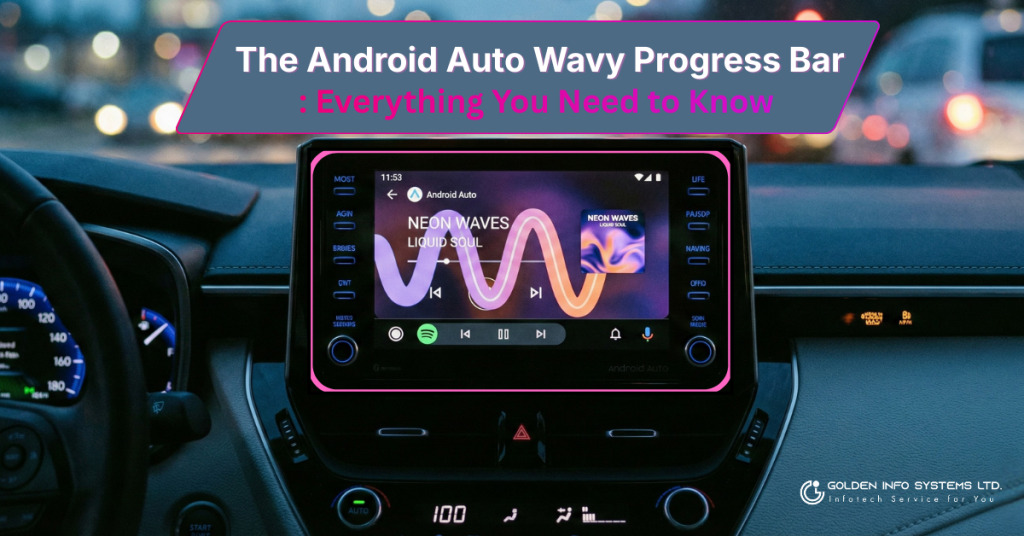
Wait, Why Is My Music Squiggly?
If you have hopped into your car recently, plugged in your phone, and noticed something different about your music player, you aren’t seeing things. That straight, flat line that used to show how much time was left in your song? It’s gone. In its place is a fun, animated, “wavy” or “squiggly” line that moves as the music plays.
For millions of drivers who use Android Auto every day, this is one of the most noticeable visual changes in years. But what exactly is it? Is it a bug? A glitch? Or is it a cool new feature that is here to stay?
In this detailed guide, we are going to dive deep into the Android Auto wavy progress bar. We will explore why Google changed it, what it means for your driving experience, and whether it actually helps you keep your eyes on the road. Grab a coffee (or a steering wheel), and let’s break it down!
What is the Wavy Progress Bar?
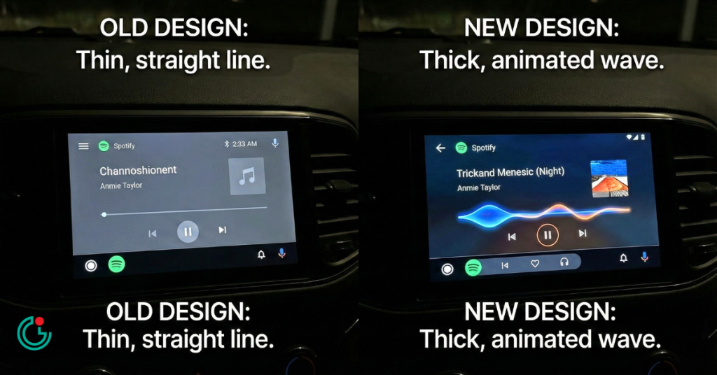
The “wavy progress bar” is a new visual element introduced in Android Auto versions 15.9 and higher (specifically noticed around late 2025). It replaces the traditional, thin, straight line that tracked the duration of your music or podcast.
The Look and Feel
Imagine a sound wave. Instead of a rigid straight line, the new bar has a gentle, undulating curve. As the song plays, the wave ripples and moves forward. It is thicker than the old line, making it visually “heavier” on the screen.
- Old Design: A thin, grey line with a small dot indicating your current position.
- New Design: A thick, animated wave that changes shape slightly as it progresses. It often pulls colors from the album art of the song you are listening to, making the interface feel more colorful and alive.
Is It Just for Music?
Currently, this feature is appearing in media apps. This includes:
- Spotify
- YouTube Music
- Podcast players
- Audiobook apps
It’s important to note that this isn’t a glitch. If you see a squiggly line, your screen isn’t broken! It is a deliberate design choice by Google.
The “Material 3 Expressive” Design Language
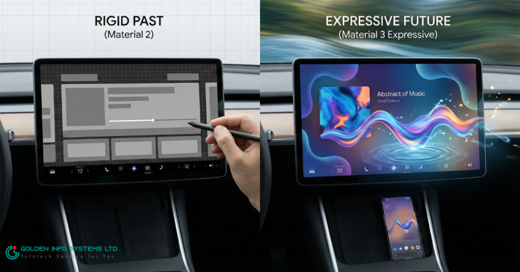
To understand why the bar is wavy, we have to look at how Google designs things. You might have heard the term “Material Design.” This is the set of rules Google uses to make sure apps look good on phones, tablets, and car screens.
The latest version is called Material 3, and this specific style is known as “Material 3 Expressive.”
What Does “Expressive” Mean?
In the past, computer screens were very rigid. Lots of boxes, straight lines, and sharp corners. Google wants to move away from that. They want their software to feel more natural and human.
- Playful: The wavy line feels fun. It has personality.
- Alive: Because it moves on its own, it shows you that the system is working and active.
- Organic: Nature doesn’t have many perfectly straight lines. A wave feels more like water or sound, which fits perfectly for a music player.
If you have a Google Pixel phone, you might have already seen this squiggly line in the media player on your lock screen or notification shade. Google is simply bringing that same “cool factor” from your phone to your car’s dashboard.
Why Did Google Change It?
Change can be annoying. We get used to things looking a certain way, and then—bam!—an update changes everything. So, why did Google bother fixing something that wasn’t broken?
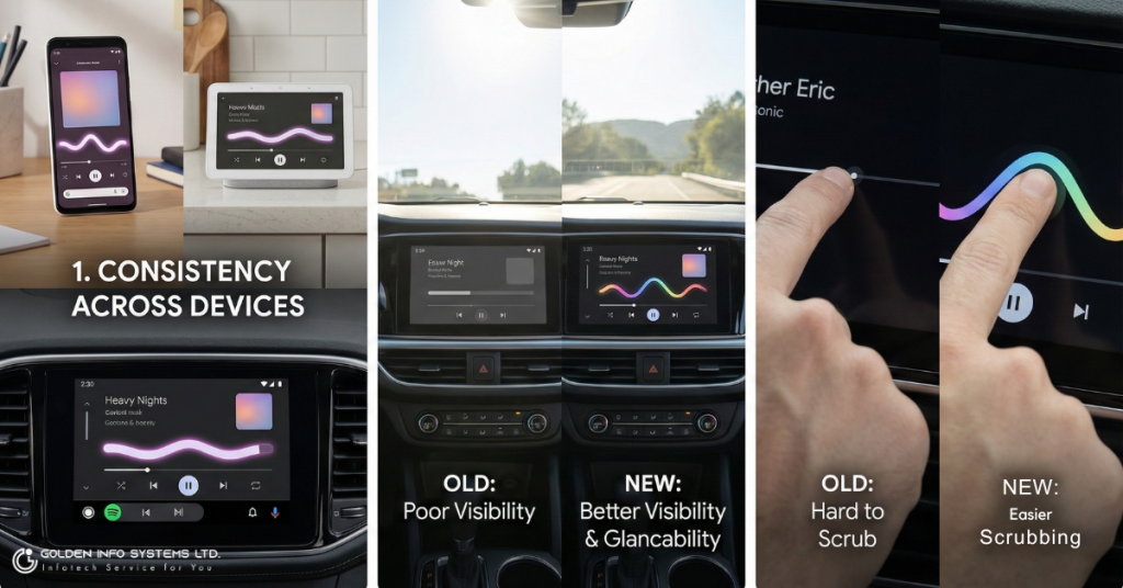
1. Consistency Across Devices
Google is trying to create a “unified ecosystem.” They want the experience of using a Pixel phone, a Nest Hub in your kitchen, and Android Auto in your car to feel exactly the same. By bringing the wavy bar to the car, they are bridging the gap between your phone and your vehicle.
2. Visibility and Glancability
This is a fancy way of saying “how easy is it to see quickly?” When you are driving, you can’t stare at the screen. You only have a fraction of a second to glance over.
- The Old Bar: Was thin. Sometimes, in bright sunlight, a thin grey line is hard to see against a dark background.
- The New Bar: Is thicker and animated. The movement catches your eye faster (peripheral vision is good at spotting movement). This means you might be able to tell if music is playing without looking directly at the screen for too long.
3. Ease of Use (Scrubbing)
Have you ever tried to rewind a podcast 10 seconds while driving because you missed a joke? It can be tough to tap that tiny little dot on a straight line. The new wavy bar is taller. This effectively creates a larger “touch target.” You don’t have to be as precise with your finger to grab the bar and slide it forward or backward. This is a huge upgrade for clumsy fingers on a bumpy road!
Safety First: Does It Help Drivers?
Safety is the number one rule for Android Auto. The National Highway Traffic Safety Administration (NHTSA) has strict guidelines on how much time a driver should spend looking at a screen.
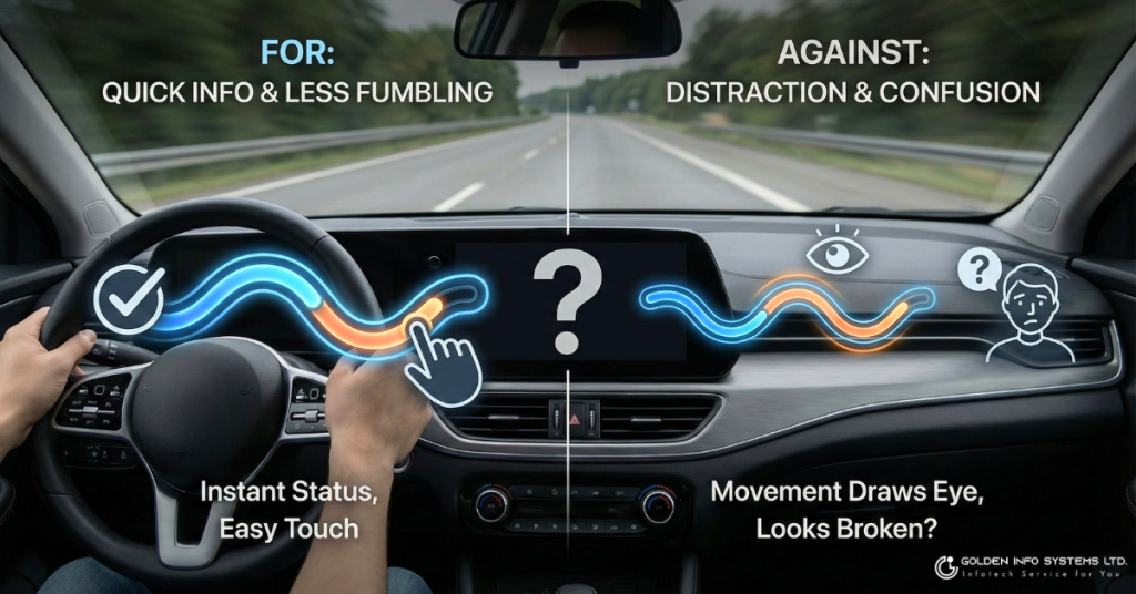
The Argument FOR the Wavy Bar
- Quick Information: The animation lets you know instantly that audio is playing. If the wave is flat, the audio is paused. You don’t have to read tiny “0:00” numbers to know the status.
- Less Fumbling: As mentioned above, a thicker bar is easier to touch. Less time fumbling with the screen means more time with your hands on the wheel.
The Argument AGAINST the Wavy Bar
- Distraction: Some users argue that animation is bad. Movement draws the eye. If the bar is constantly wiggling, does it tempt you to look at the screen more often than a boring static line?
- Confusion: For older drivers or those not tech-savvy, a squiggly line might look like an error or a broken screen, causing them to fiddle with it to “fix” it.
Overall, Google’s research typically suggests that “glancability” (getting info quickly) is safer than static text that requires reading.
The Controversy: Muscle Memory and Button Layouts
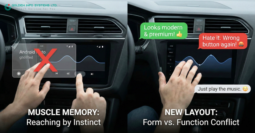
The wavy progress bar didn’t come alone. It brought some friends, and people aren’t happy about them.
Along with the visual update, Google has been testing a rearrangement of the media control buttons.
- Previously: The “Next Track” and “Previous Track” buttons were often spaced out or located in specific corners.
- New Layout: The controls are tighter, and in some versions, the Play/Pause button has moved to the left or right, rather than being dead center.
Why This Matters
Muscle memory is a powerful thing. When you drive, you don’t look at the screen; you reach out by instinct. You know exactly where the “Skip Song” button is. If Google moves that button two inches to the left, you might accidentally restart the song instead of skipping it. This causes frustration and forces you to look at the screen to correct your mistake—which is exactly what we want to avoid while driving.
User Feedback: Reddit threads and forums are full of mixed reviews.
- “It looks modern and premium!” says one user.
- “I hate it. I keep hitting the wrong button because everything moved,” complains another.
- “Why do we need a squiggle? Just play the music,” argues a third.
It is a classic case of form (looking good) vs. function (working effectively).
How to Get the New Look (or Revert It)
So, do you have it yet?
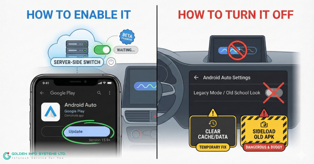
How to Enable It
You cannot simply go into “Settings” and flip a switch called “Wavy Bar.”
- Update Your App: Ensure your Android Auto app is updated to version 15.9 or newer. Check the Google Play Store.
- Server-Side Update: This is the tricky part. Google turns this feature on remotely. You might have the latest app version but still see the old straight line. This means Google hasn’t “flipped the switch” for your account yet. Be patient!
- Beta Program: If you are impatient, you can try joining the Android Auto Beta program on the Play Store, though it is often full.
How to Turn It Off
Here is the bad news: You likely can’t. Once Google rolls out a visual overhaul like this, it usually becomes the new standard. There is rarely a “Legacy Mode” or “Old School Mode” option in Android Auto settings.
Temporary Workarounds (Not Recommended):
- Some users report that clearing the “Cache” and “Data” of the Android Auto app temporarily reverts the layout, but it usually updates itself again within a few days.
- Uninstalling updates and finding an older version of the app (sideloading) is dangerous and can cause security issues or connection bugs with your car.
The best advice? Give it a week. Your brain will adjust to the new look, and you might find you prefer the larger touch targets.
The Bigger Picture: Gemini and the Future of Android Auto
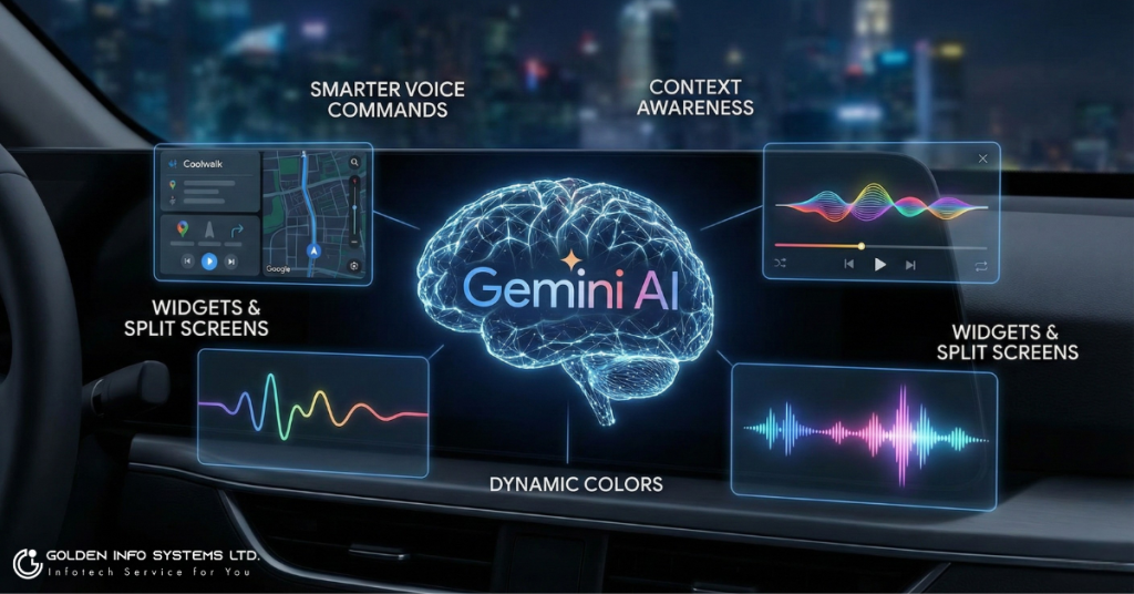
The wavy progress bar is just the tip of the iceberg. It is a small signal of a much larger transformation happening inside your car.
Enter Gemini
Google is slowly replacing “Google Assistant” with Gemini, their new AI.
- Smarter Voice Commands: Instead of just saying “Play rock music,” you might soon be able to say, “Play that song with the heavy guitar solo I was listening to last Tuesday,” and Gemini will figure it out.
- Context Awareness: The new UI (including the wavy bar) is designed to host these smarter features. The “expressive” nature of the design is meant to match the “conversational” nature of the AI.
Widgets and Split Screens
Android Auto is also leaning heavily into “Coolwalk,” the split-screen dashboard view. The wavy progress bar is designed to look good even when the music player is shrunk down into a small card on the side of the screen.
What’s Next?
- More Colors: Expect the interface to change colors more dynamically based on your album art.
- Smarter Maps: Navigation that learns your habits better.
- Better Voice Animations: When you talk to the car, expect to see that wavy line transform into a glowing, listening animation (similar to the new Siri on iPhones).
Wrap Up
The Android Auto wavy progress bar is more than just a squiggly line. It is a statement. It shows that Google thinks our car software shouldn’t just be a boring utility; it should be modern, fun, and beautiful.
While the change might mess up your muscle memory for a few days, the benefits—better visibility, easier scrubbing, and a cohesive design—are solid improvements. As cars become more like computers on wheels, interfaces like these will only get more common.
So, the next time you see that wave rippling across your dashboard, don’t panic. It’s just Android Auto waving hello to the future.
Frequently Asked Questions (FAQ)
Q: Can I change the color of the wavy bar? A: Not directly. The bar usually pulls colors from the album art of the song playing. If you play a darker album, the wave might be white or grey. If the album is bright red, the wave might pick up a pink or red accent.
Q: Why is my pause button in a different spot? A: Google is testing new button layouts to go with the new design. You currently cannot move these buttons back manually.
Q: Does this work with Apple Music on Android Auto? A: Yes! The progress bar is part of the Android Auto system, not the specific app. So whether you use Spotify, YouTube Music, or Apple Music, the system draws the bar the same way.
Q: My wave stopped moving. Is it broken? A: If the wave is flat, your music is likely paused or buffering. If music is hearing but the wave is flat, try disconnecting and reconnecting your phone.


